Top Reasons Users Don’t Check Out (And How to Design For Them)
With Thanksgiving and Black Friday upon us, we surveyed our designers for the top factors impacting checkout conversions. Drawing on their hundreds of hours testing web and mobile checkouts with users, here are some common reasons why users drop out rather than check out. We’ve also added tips for how to design for these.

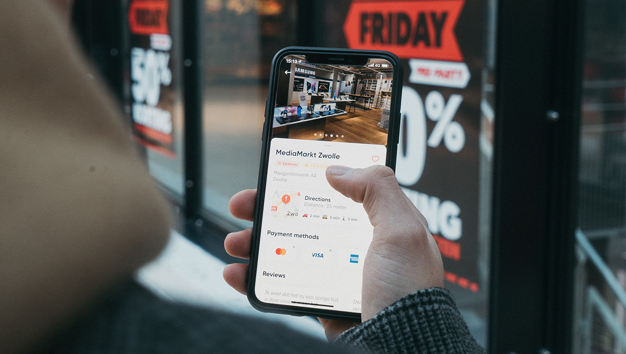
Image Credit; CardMapr
Best price addiction
Everyone loves a deal! In our deal driven culture savvy shoppers can often feel like they need to do “just one more” price comparison to check if the item they want is cheaper elsewhere, or if they can save on delivery charges, use a promo code lurking somewhere out there. This is especially true the higher the value of the item, in our experience.
Suggestion: Always place promo codes upfront so that users can’t miss them. Plus, mapping your purchase journey across different price points may reveal opportunities to optimize conversion points.
Don’t make me enter my card details!
This is especially true at peak seasons, when users want to keep the process simple, and the cognitive load light. If you don’t have the payment options users are comfortable with, or worse if it requires them to leave their sofa to find their physical wallet, then they are likely to look elsewhere.
Suggestion: Integrating digital wallets like Shopify, Apple Pay, and PayPal can save customers lengthy account creation and keep the shopping experience seamless.
If you don’t have the payment options users are comfortable with, or worse if it requires them to leave their sofa to find their physical wallet, then they are likely to look elsewhere.
Delivery Options
It’s fair to say many users expect to see a free delivery option, and interestingly we’ve found that the type of delivery service needs to be well known, or deemed reliable in the mind of the user to provide reassurance.
Suggestion: Upfront presentation of available delivery options, and minimum spend for free delivery can increase check out completions and upsell. The same can be said for easy returns processes too.
Hidden Terms and Charges
Continued from above, customers often complain about hidden delivery charges, delivery lead times, or other factors they weren’t expecting. Unless your brand offers a compelling reason to proceed, such as hassle free returns or the choice of specific delivery dates, this can be enough to lead the user to drop out of the final purchase.
Suggestion: Make charges and lead times clear up front, ideally on the product listing itself, and consider additional ‘value’ elements you can add at the same time. Consistently signposting the compelling reasons to purchase can’t hurt either.
Customers often complain about hidden delivery charges, delivery lead times, or other factors they weren’t expecting.
My Basket is Really My Wishlist…
…until the next best offer. It can be frustrating, but in our experience customers can use the basket as a way to hold the item they want while they do further research to see if they are getting the best deal, or to return to at a later point.
Suggestion: Use web metrics and testing to fine tune the placement of promo codes for new customers. ‘Saved items’ reminders may prompt purchases from registered users.
Cross-device Purchasing
Some consumers may still feel more comfortable browsing on their phone but purchasing from a laptop, or vice versa, and brands need to cater for a seamless switch between devices. Also, it’s sometimes the case that web pages are easier than mobile for users to explore discount codes, e.g. when using integrated apps or cash back websites such as Honey, Quidco, TopCashBack etc.
Suggestion: Understand customers purchasing behaviors and preferred devices, through observation and data metrics, and design purchasing journeys that meet their needs.
Do you need help determining if your checkout experience is up to scratch? Our fast turnaround UX Review identifies pain points and quick fixes, plus pointers for future activities to optimize your purchasing experience.
