Just when will you use the Apple Watch?
Where will the Apple Watch fit into a person’s device ecology, and how will task complexity and duration impact usage and uptake?

I’ve been thinking recently about where the Apple Watch fits into with the modern day user’s plethora of devices. We all have laptops, tablets, and smartphones and now we’ve got the Apple Watch (other smartwatches are available) to squeeze into our lives.
We’ve grown used to the idea of specific devices being used for different types of task. For example, I might be able to reply to a text or quick email on my smartphone, but for a longer email or to write a document, I’ll turn to my iPad or more than likely, my laptop. But if I’m on my laptop and need to check my bank balance, then it’s a lot easier and quick to pick up my iPhone and log into my Natwest bank app using TouchID.
A couple of things seem to dictate the device I’ll choose for specific tasks:
- Duration of interaction
- Complexity of interaction

The longer the duration of the individual task, the larger the screen I’m likely to need. For example, I might start writing a quick email on my phone, but if it looks like it’s going to turn into a short novel, then I’ll pick it up on my laptop.
The complexity of the interaction is the other defining factor. The more complex the interaction, the more likely a small screen is going to be inhibiting. The larger screen iPhones seem to have bypassed some of this awkwardness, but it’s likely to become a much bigger factor with the Apple Watch. The device isn’t best suited for complex interactions. I recently saw a calculator app that I have on my iPhone get updated with an Apple Watch counterpart that will enable me to do calculations on my watch. Would I really be sat at a restaurant calculating how to split a bill or tip on my watch? Or would it be a lot simple and faster to do it on my iPhone? Probably. It’s a short interaction, but a complex one and complex interactions aren’t suited to a 38-42mm screen.
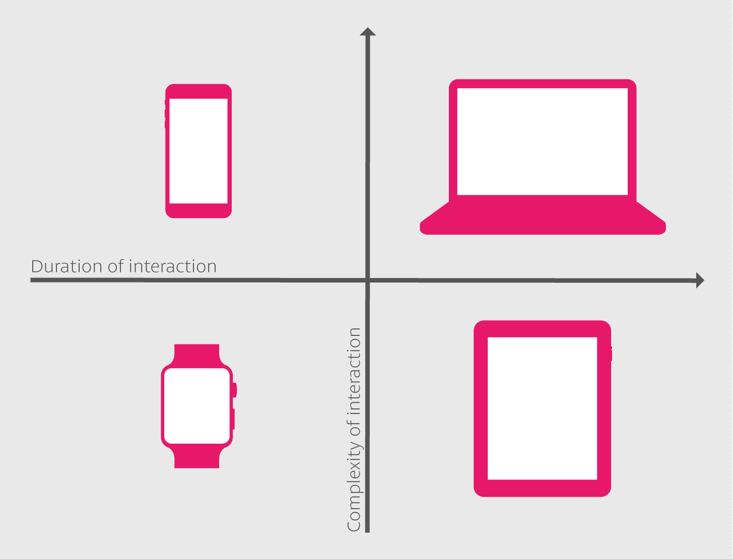
So we start seeing how these two dimensions of interaction duration and complexity might work together:

Duration and complexity of interactions
From this chart, you can quickly see where the different devices fit into a user’s device ecology. It’s not quite as black and white as the chart points out – for example, you could often equally turn to your laptop as much as your iPad, but broadly speaking it’s a good indication of which device a user might turn to – and therefore how developers could design for the different devices. Let’s skip those Apple Watch word processor apps for the time being…
