Iteration, and the essence of a design
Iteration is the foundation of good design and it’s something that’s been used in good designs throughout history. Iteration strips away the unnecessary and irrelevant, refining a design to produce an end result that is better than the original.

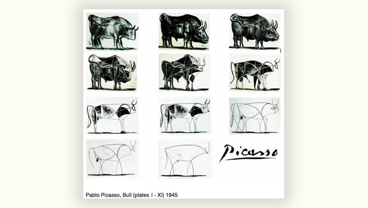
Picasso knew this, and illustrated it perfectly in his famous bull sketches where we starts with a realistic image of a bull and through stripping away details such as shading, lighting, contours, etc he found the true essence of a drawing of a bull – still instantly recognisable.
Now this is an extreme, but it’s an allegory for good design, and particularly interface design. By stripping a design back to the bare essence – leaving only what’s essential, it’s possible to get a clearer picture of what’s important.
Mobile-first interface design stems from this same philosophy. By designing an interface for a mobile screen first, the limited space forces designers to focus on what’s really important – extra features that aren’t essential and take up screen space are relegated elsewhere or removed entirely. This can then be used to inform the design of a desktop-size interface. It’s not an easy process as it’s always easier and more tempting to say ‘yes’ to a new feature or design element than it is to say ‘no’. The minimal, essential approach is difficult but produces a purer form at the end.
At the basis of all of this is iteration. It’s the process of gradually removing what’s not important to reveal the hidden truth of an interface – the important, essential core. And if a design can do that one thing, or those few things, well then future additions can be evaluated against that core design to see where it adds value and how it connects best with the design.
