Design that Inspires: Childline – NSPCC animation
I came across this animation last month whilst doing research for an animation project, and I was awestruck. Not only for its beautiful style and stunning transitions, but also for the way it powerfully and gently tackles such a delicate subject.
The video was directed and animated by Moth Collective for Childline, NSPCC, and Lovers Agency, and it was part of their campaign helping to raise awareness of teenage suicide.
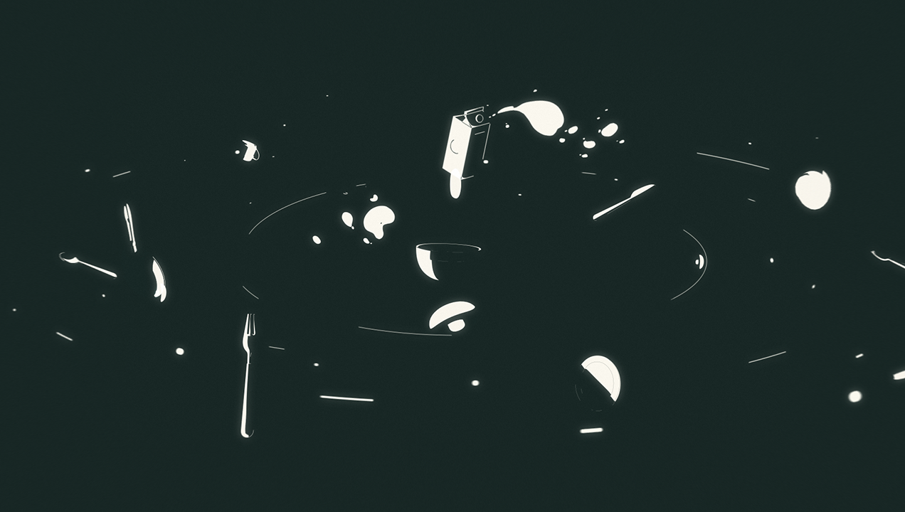
The animation starts off with a pervasive sense of gravity, holistically conveyed by the narration, the visuals and motion – dominated by the dark background and floaty elements – and finally the effective sound design.

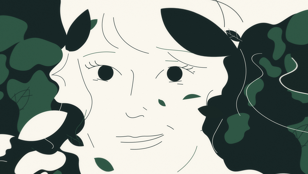
This sense of gravity gets a bit lighter as the narration shifts its focus on things the person has tried to get better and to keep going – some that have worked and some that didn’t. The music changes and the colors start shifting in favor of the lighter tone, to end with the original scene of the breakfast table, this time all visible and reversed in color.
The first person narration really goes above and beyond by creating a connection with an audience that might be struggling. It’s also not just delivering an obvious positive message: as well as communicating the fact that things can get better, it talks about the difficulties of the moment in finding something that worked for him. To compliment this, the voiceover feels human and realistic.

The visual style is simple yet striking, with a mix of line work and blocks of color, and a beautiful play of light and shadow. The nicely crafted transitions add that extra bit of flow to the animation, and the subtle sense of depth adds character to a seemingly flat style.
Producing an animation involves hard work and coordination of different parties and professionals, and Moth managed to get every aspect perfect and aligned, with the result communicating a powerful message – narratively, visually, in motion and in sound.
Nice one Moth Collective!
